overview
Softwear: Adobe Photoshop, Illustrator
Timeline: 3 Months
Skills: Graphic Design, Style Guide, Design Systems
For this project, I worked with an agency that was developing a new website. They were alert about 1/2 to 2/3 of the way done with the site. While they were in development, building out page and doing some basic UI and UX, the brand was getting finalized. This is where i came in. I help improve some usability along with acceptability and inject it with a lot of brand elements color style.
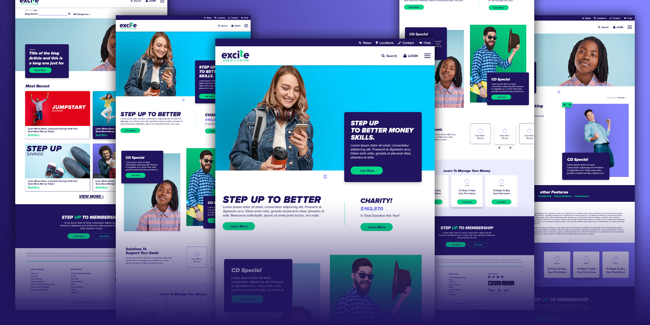
Homepage
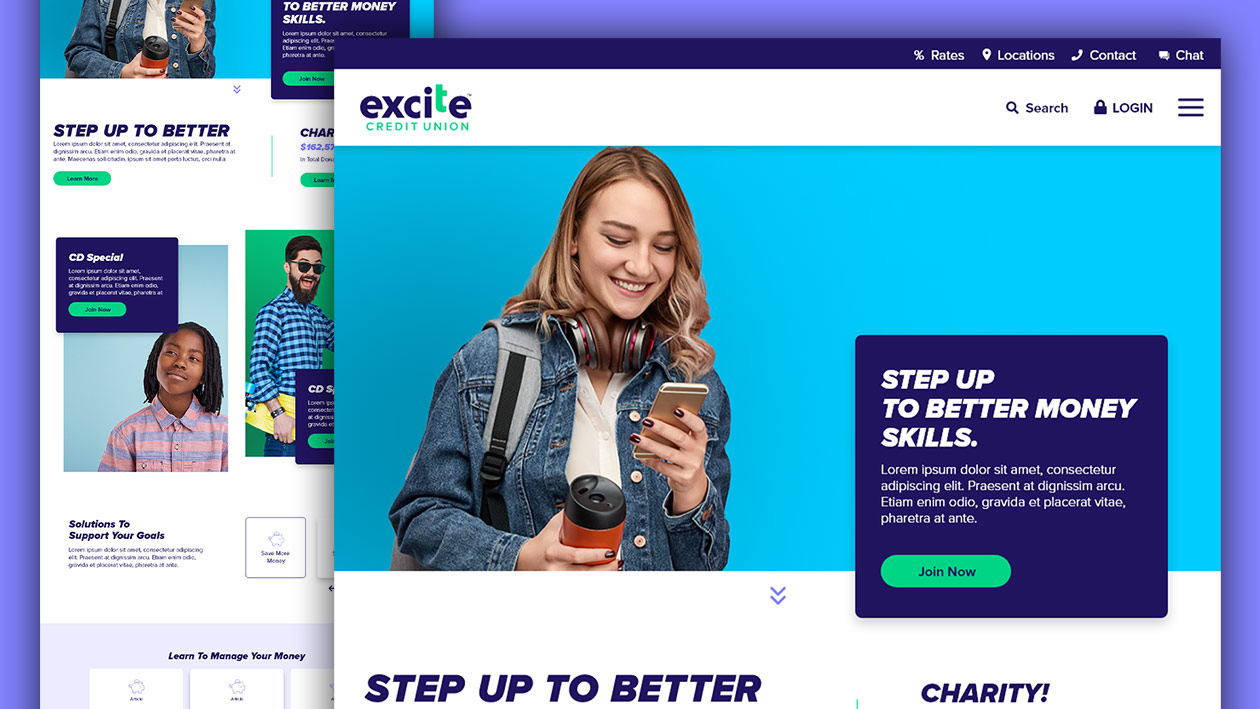
Here is the homepage hero section (above the fold), mostly cleaning up the top navigation to simplify it and prove an excellent typography structure.
Produced primary and secondary buttons, focusing on typography and brand style such as the word ”up” being highlighted like the tagline for the company “STEP UP TO BETTER.”
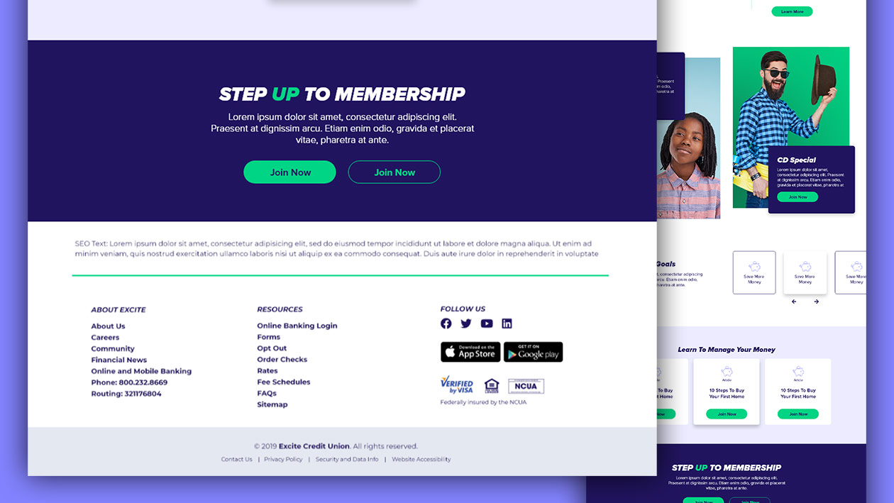
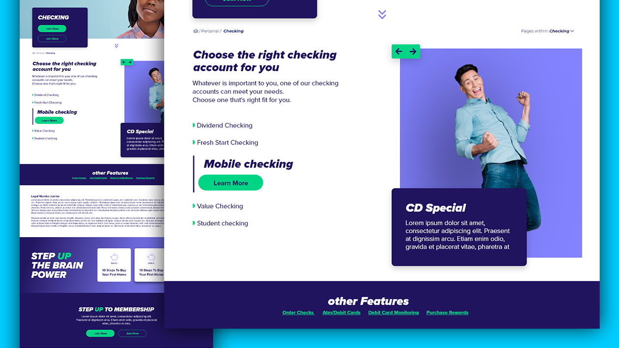
Sections/modules
A fun, creative carousel section focusing on product or feature
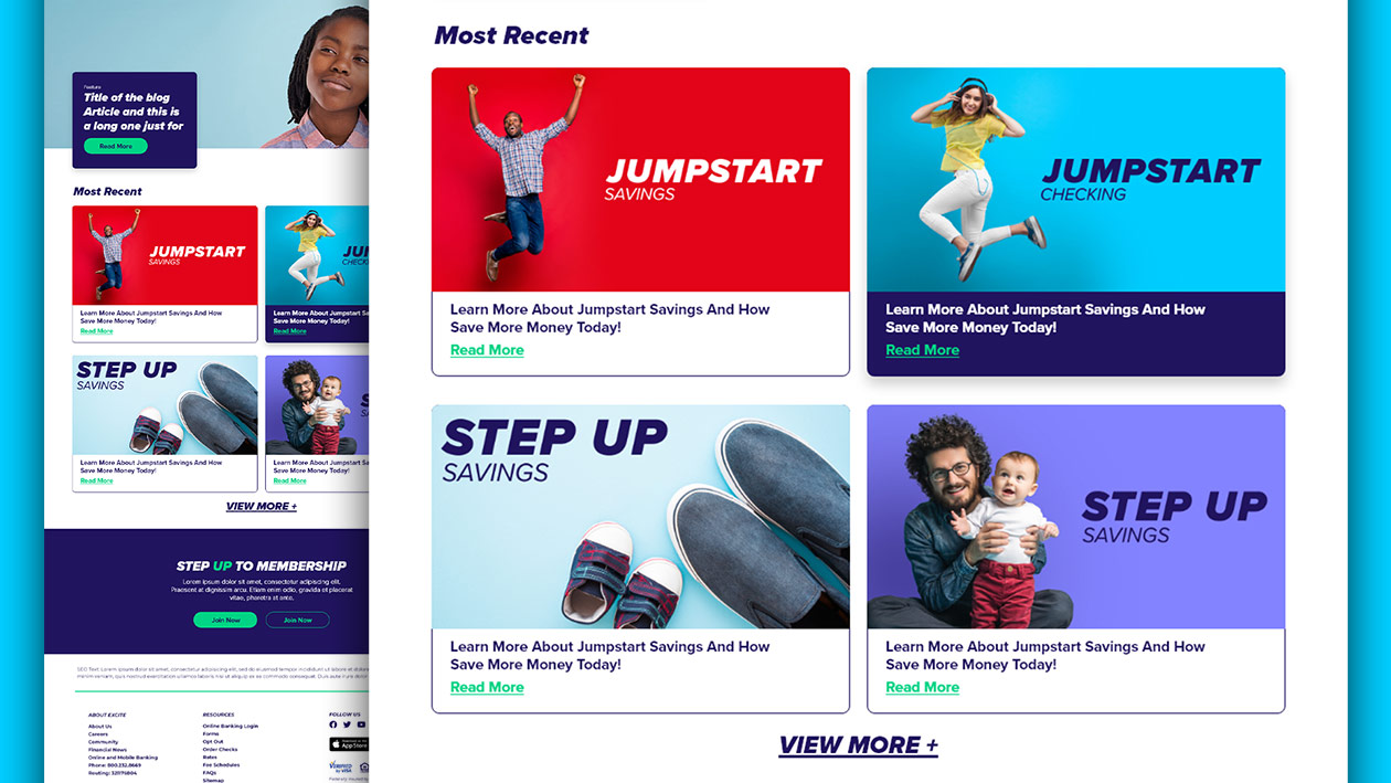
Blog section focusing on just what a blog area or section would look like
Navigation
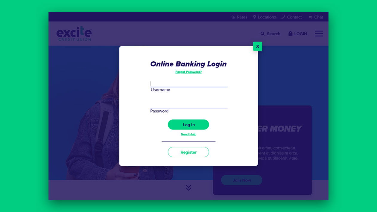
In the original version, this was just a drop-down in the menu, but we switched it over to a pop up to help focus a user on logging in
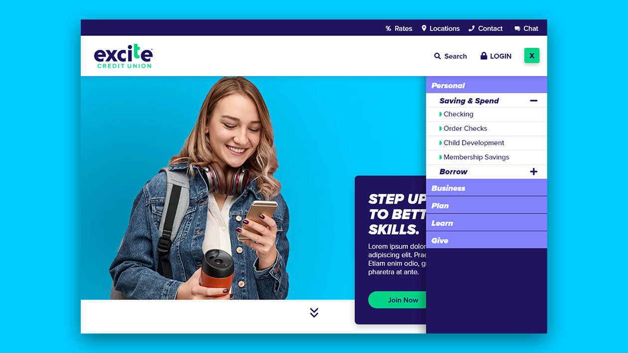
Navbar shows off all the sections while still keeping the top nav clean
style Reference
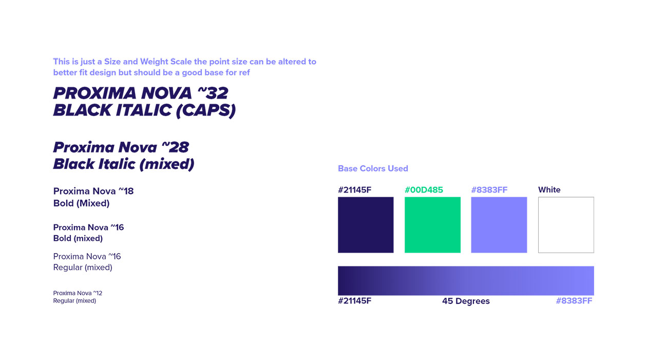
Small guild to help explain the font structure and the color that are on-brand. This was much less of full site design, and more of an empowered development team to develop while keeping things on brand.