First off a little bit of background. I am doing this to learn and hopefully improve my UI/UX study. I finished the game and enjoyed it. With that ill be pointing out the good the bad. Ill be only reviewing the main menu and the setting menu because they are similar and feel like the same designer worked on it. There is a sub UI in the computer once you get out of the animus but ill ignore it for now.
Clickable Prototype and Wireframe* I made this using adobe XD to get some practice with the program.
Inconsistency
Lack of a Grid of any kind and off alinement.
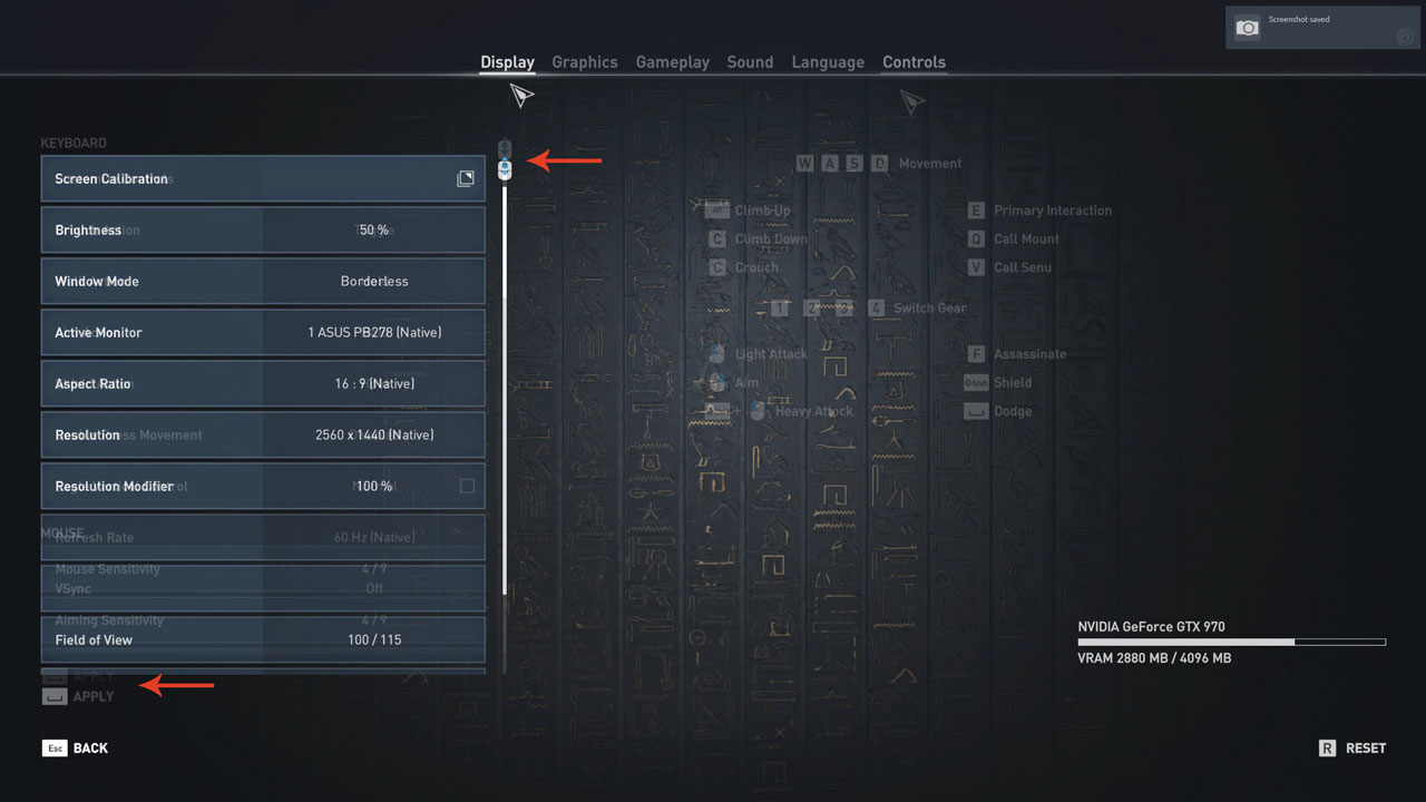
Just overlayed two pages Display and Control UI pages. Why is the scrollbar not the same hight? Why is the box not the same hight? :(
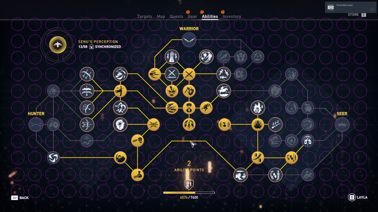
Just overlayed a circle grid. The circle grid was aligned with the six upgrade items in the middle. Why is everything just a little off? And finally why is the Synchronized graphic in the top left not aligned to any of the circles.
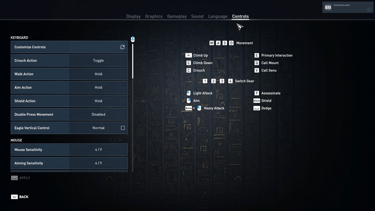
Why is WASD Movement BTN and 1234 Switch Gear? This is a simple one but really why is the spacing not the same.
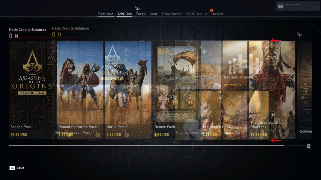
The Featured page has a Different Grid then all the other purchases pages. The Title Helix Credits balance is not on the same level, and the grid in the middle is using custom sizes that are bigger than the other sizes.
Conclusion
This is not to point out how bad the game is or how bad the UI is. This is just a study to understand and try to find out why something went wrong. My gut tells me that the reason we see some inconsistency is due to last min additions to the interface. And at this point, an enginery did the design based on the previous UI elements.